
Installed the developer beta for Tahoe (mainly to check out the Liquid Glass user interface) on my MacBook Pro (M4 M3 Pro – typo). The light/clear appearances has the potential for making readability difficult (reminding me of Yosemite back in the day). Increasing the contrast (in accessibility) does help with creating some separation between windows. Since this is a few builds in from the original that was released during WWDC, Apple may have made some tweaks since that time. This light appearance is something I wouldn’t use.
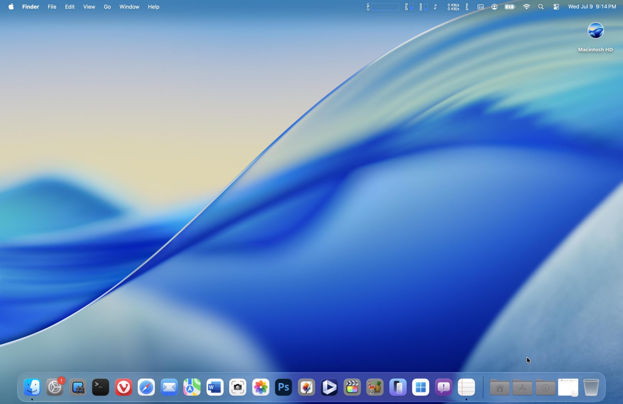
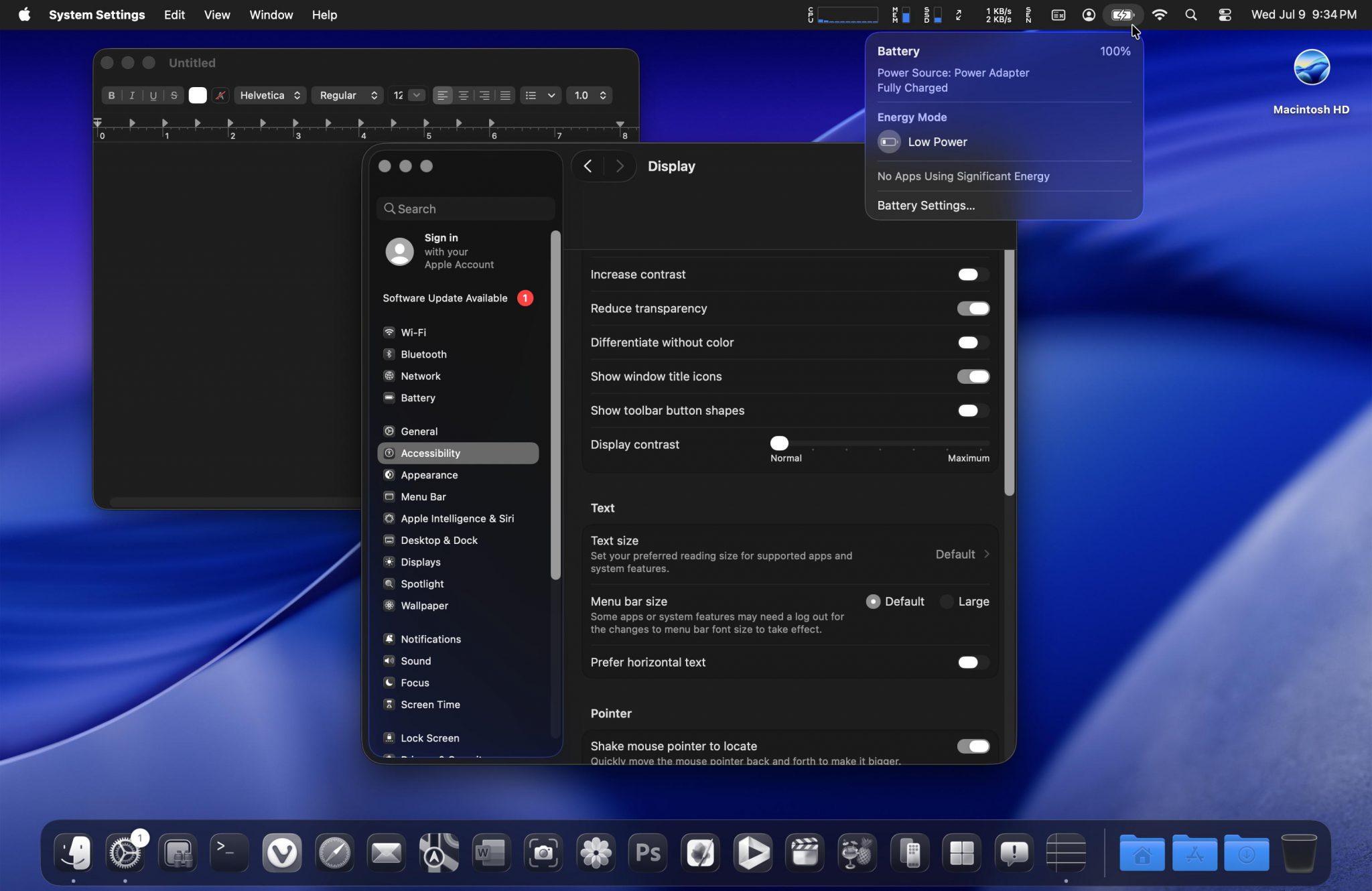
The above is with the default contrast and transparency, no menu bar background
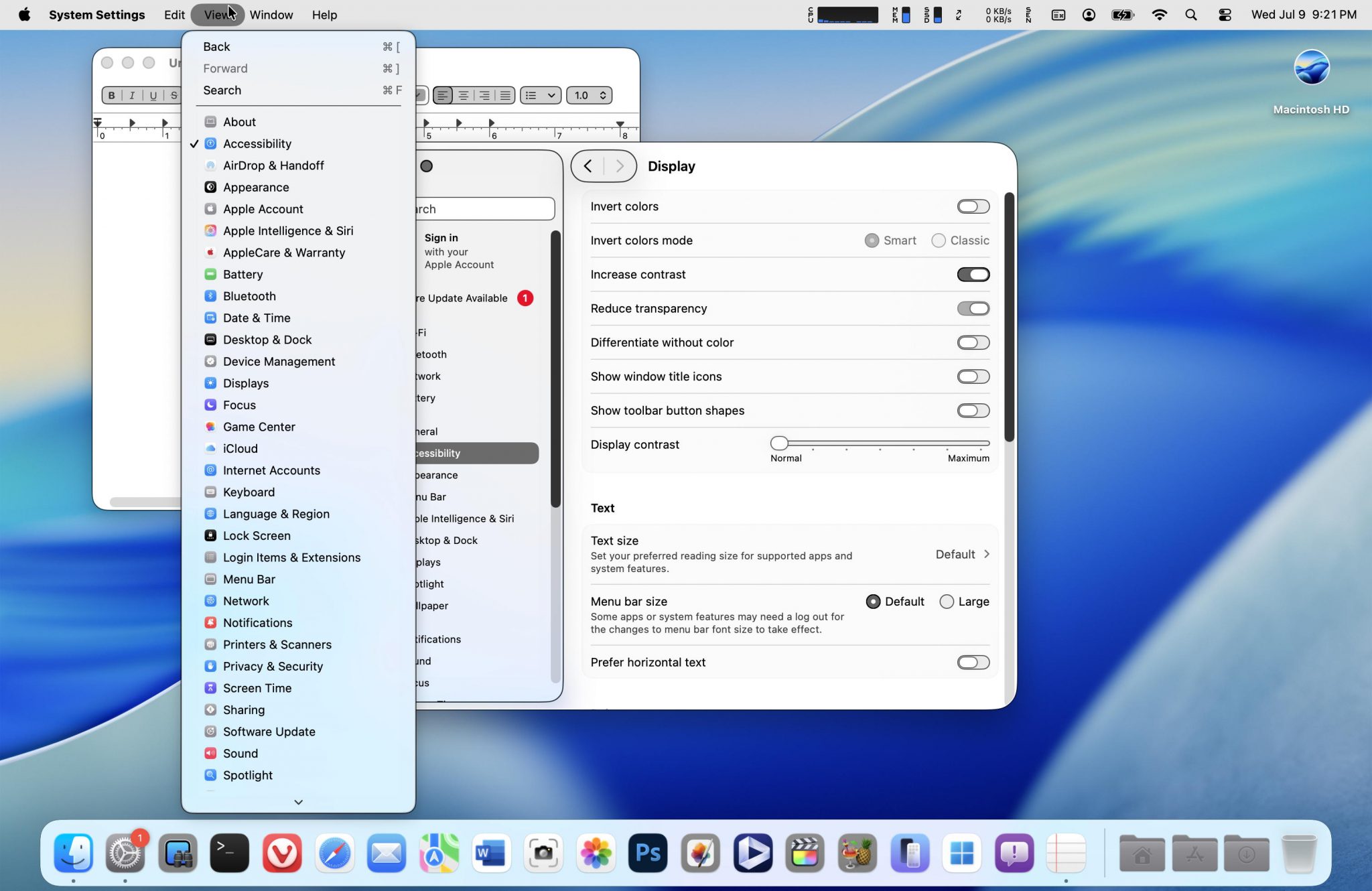
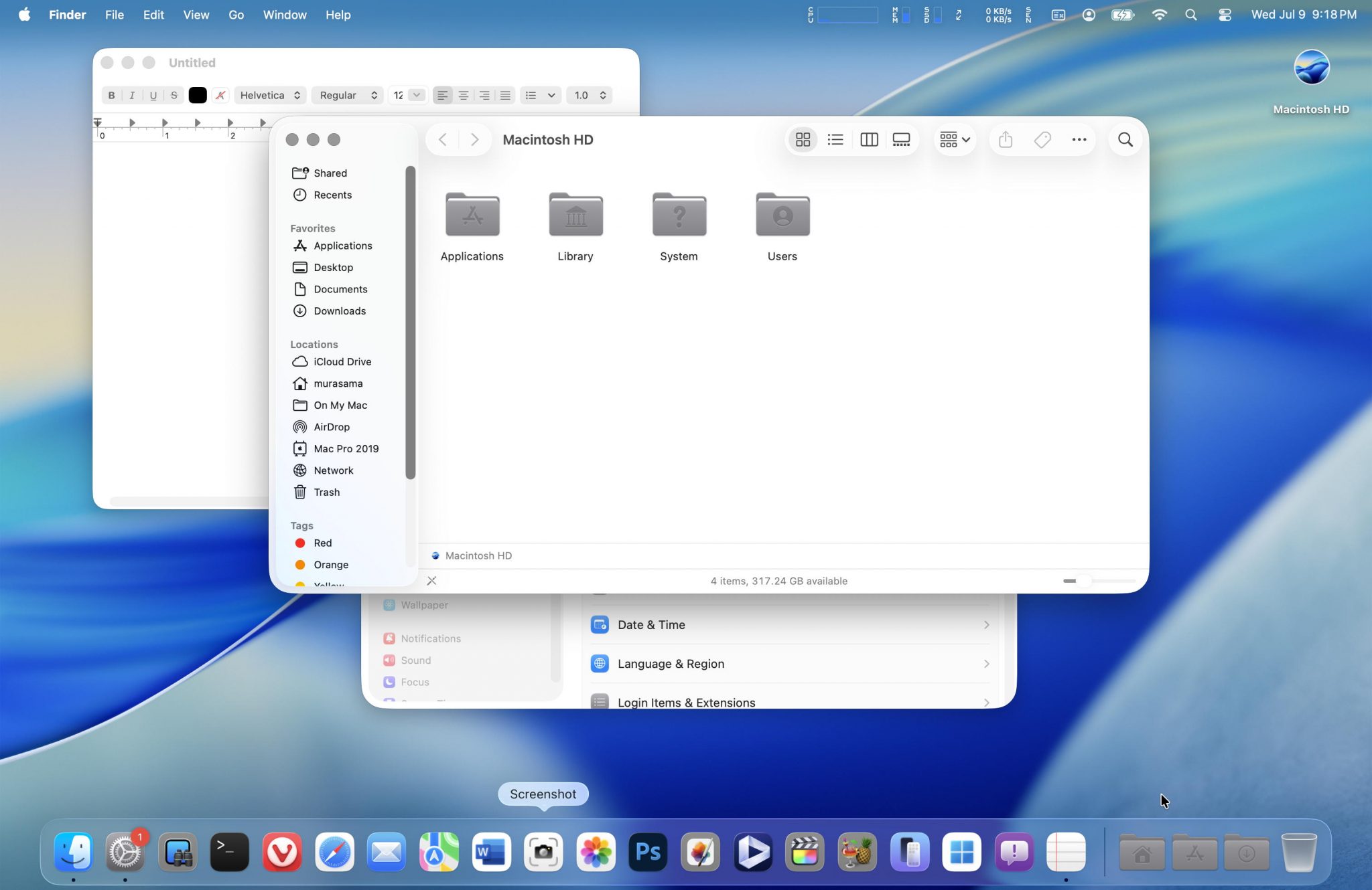
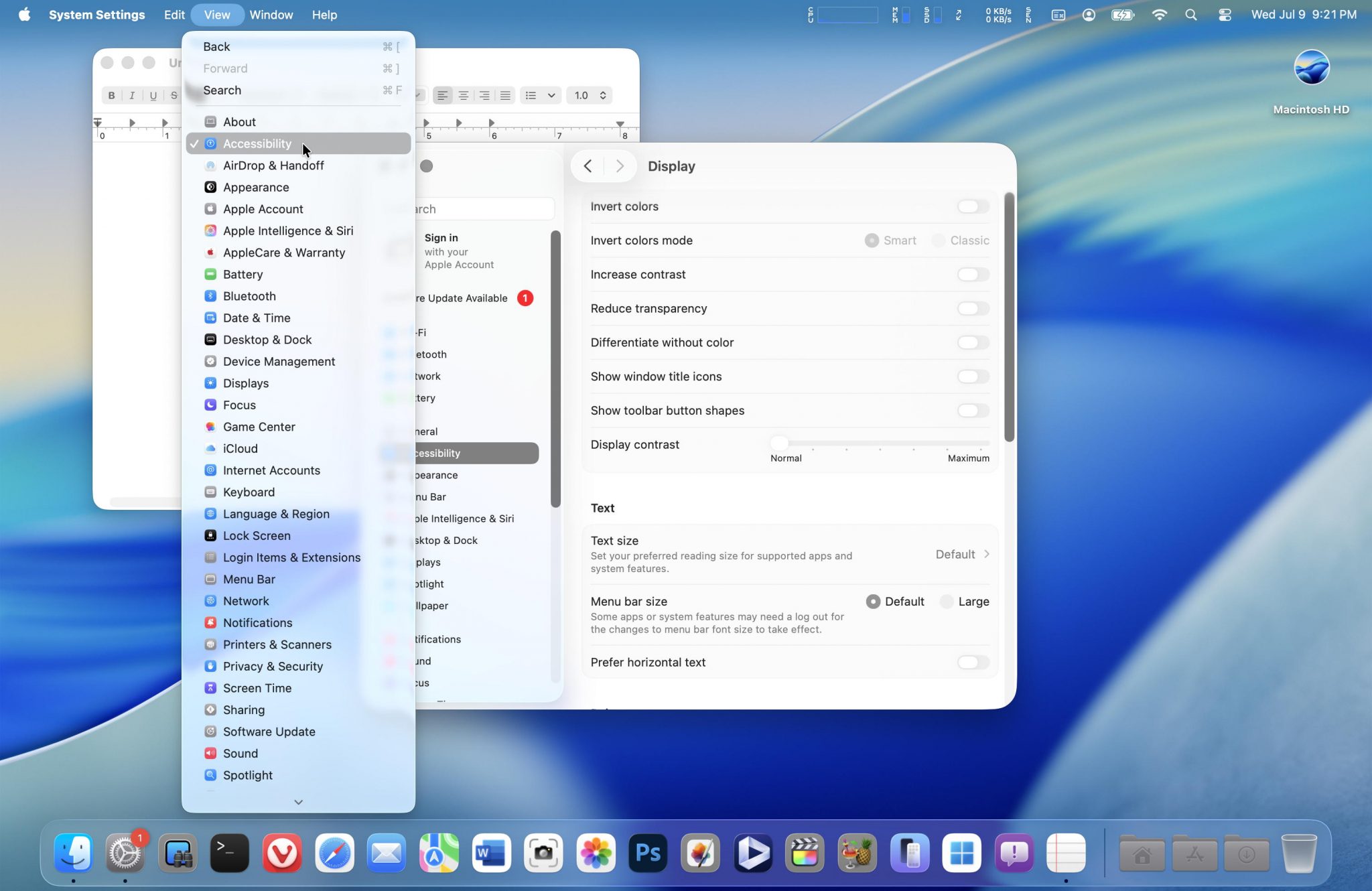
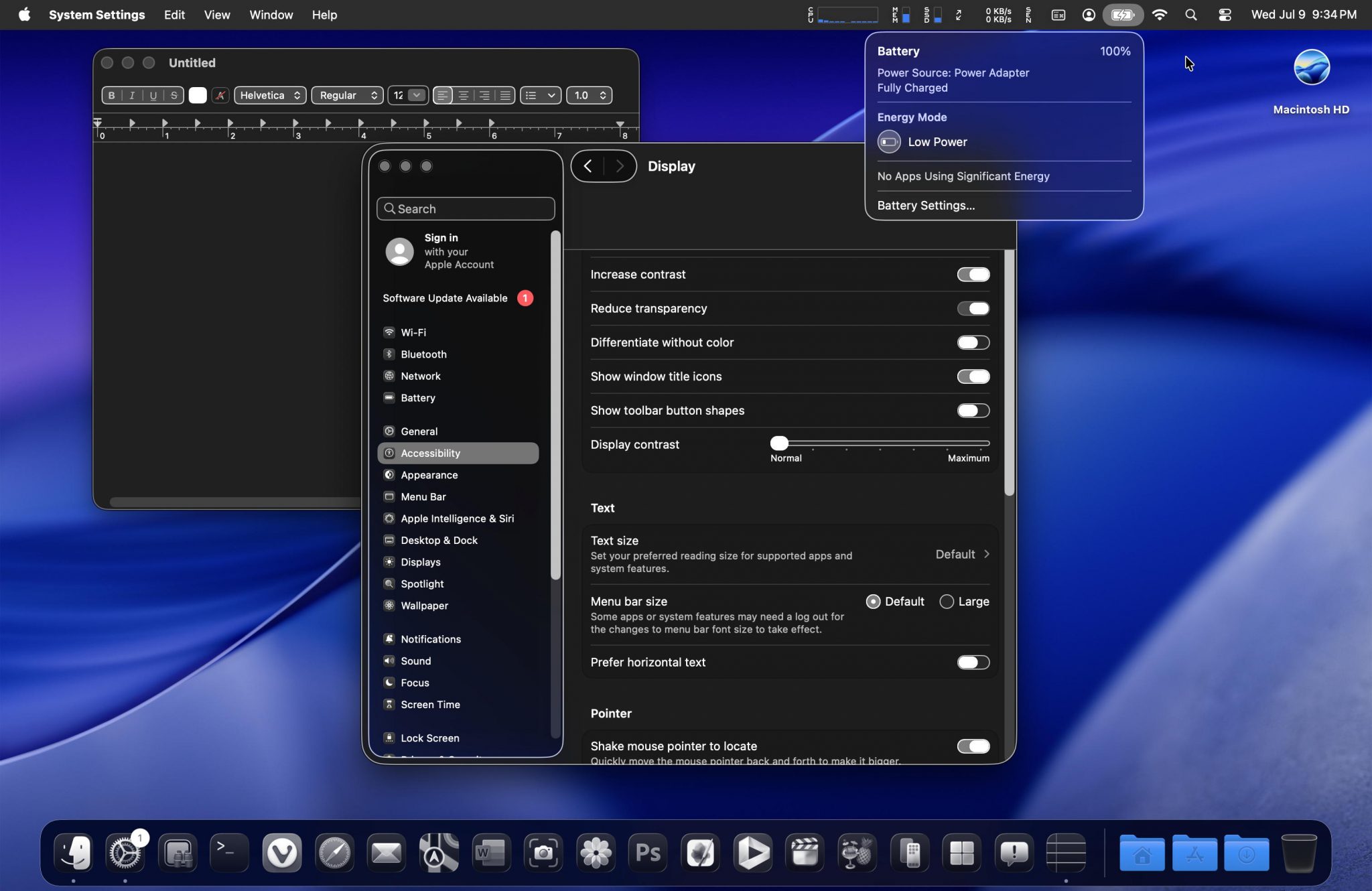
Increasing the contrast automatically reduces the transparency. The added outlines do make things easier to see. The only downside is the dock (IMHO).
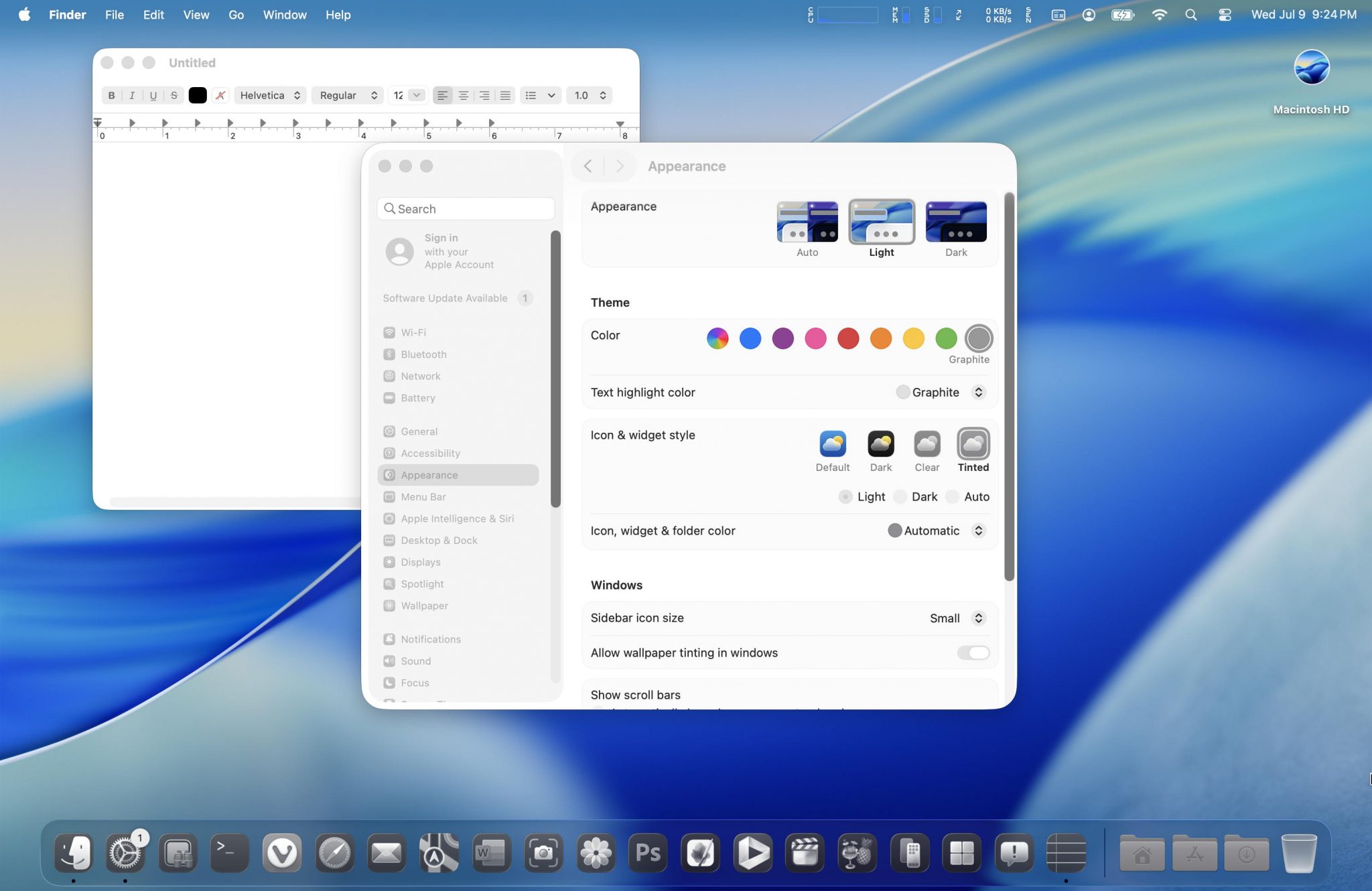
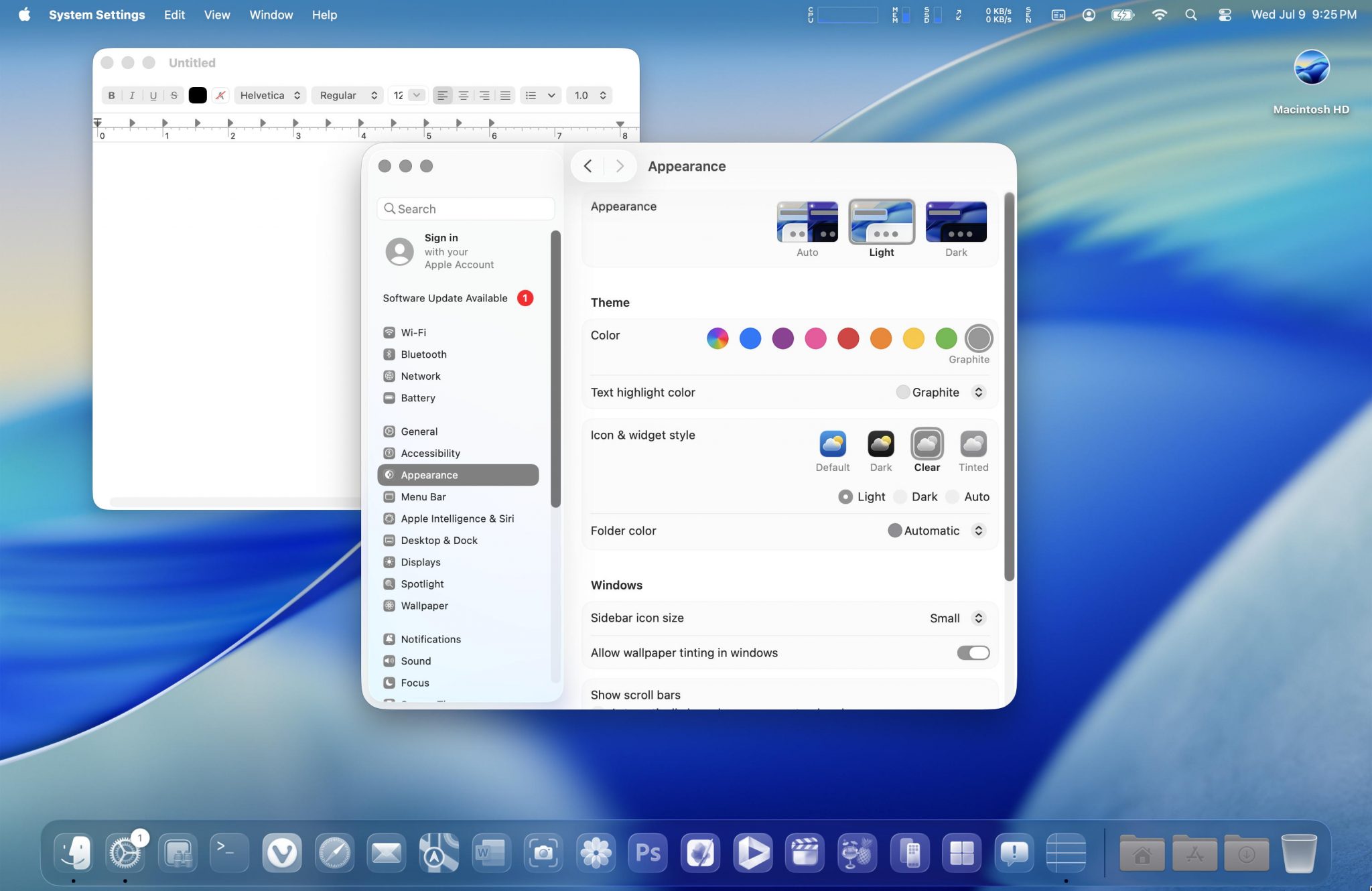
The above two screenshots (without increased contrast/reduced transparency) show what the tinted and clear icon settings look like.
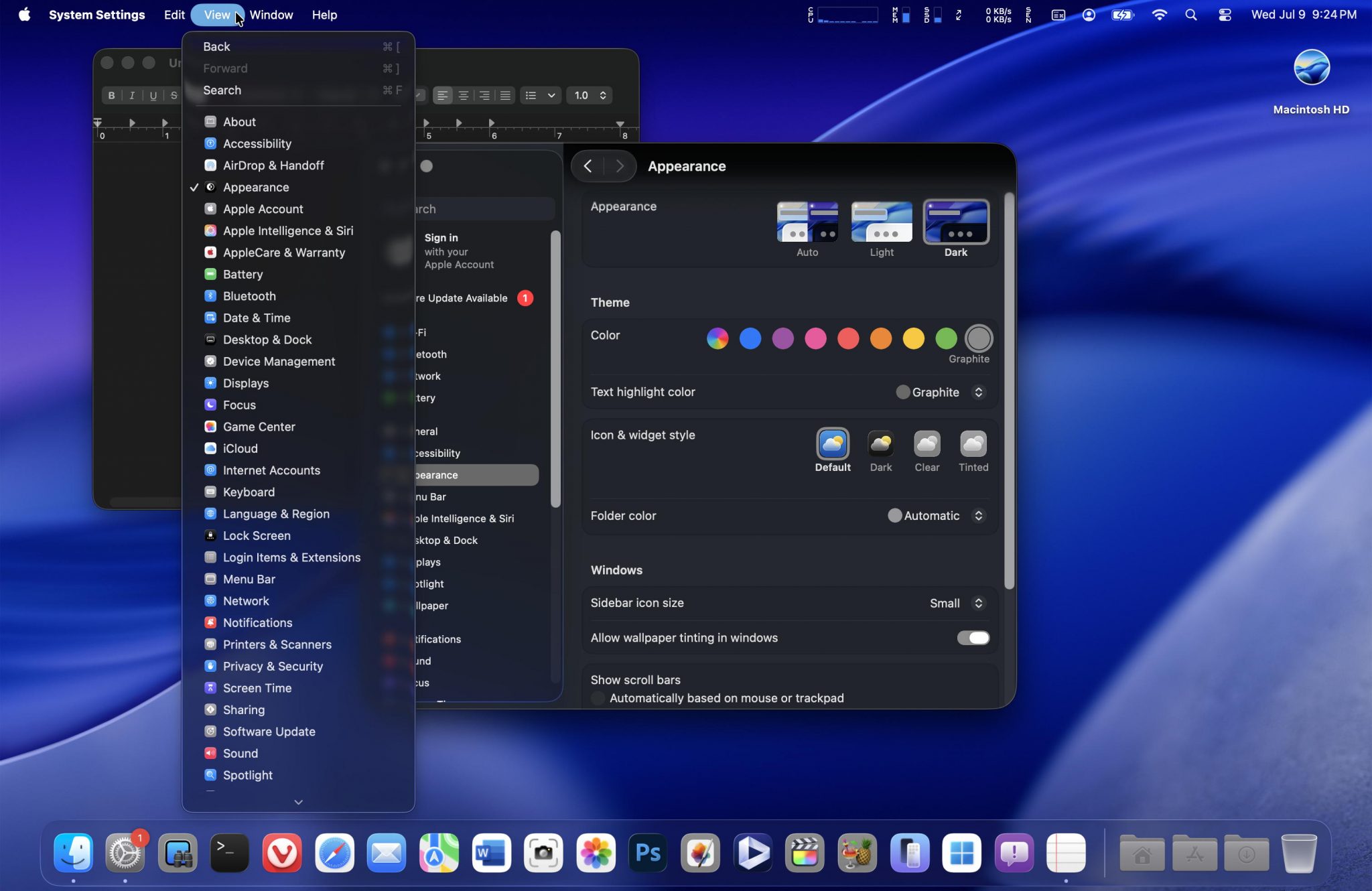
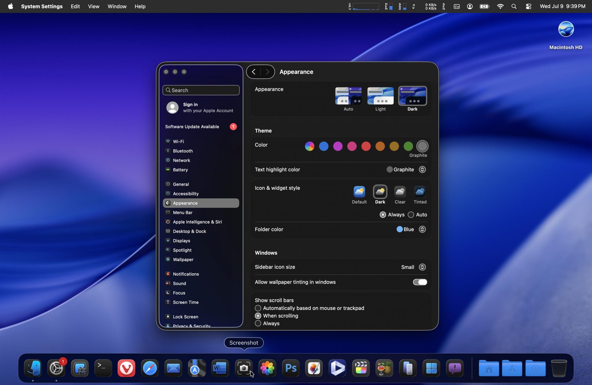
Switching to the dark appearance, I found this to be much better (for usability and readability).
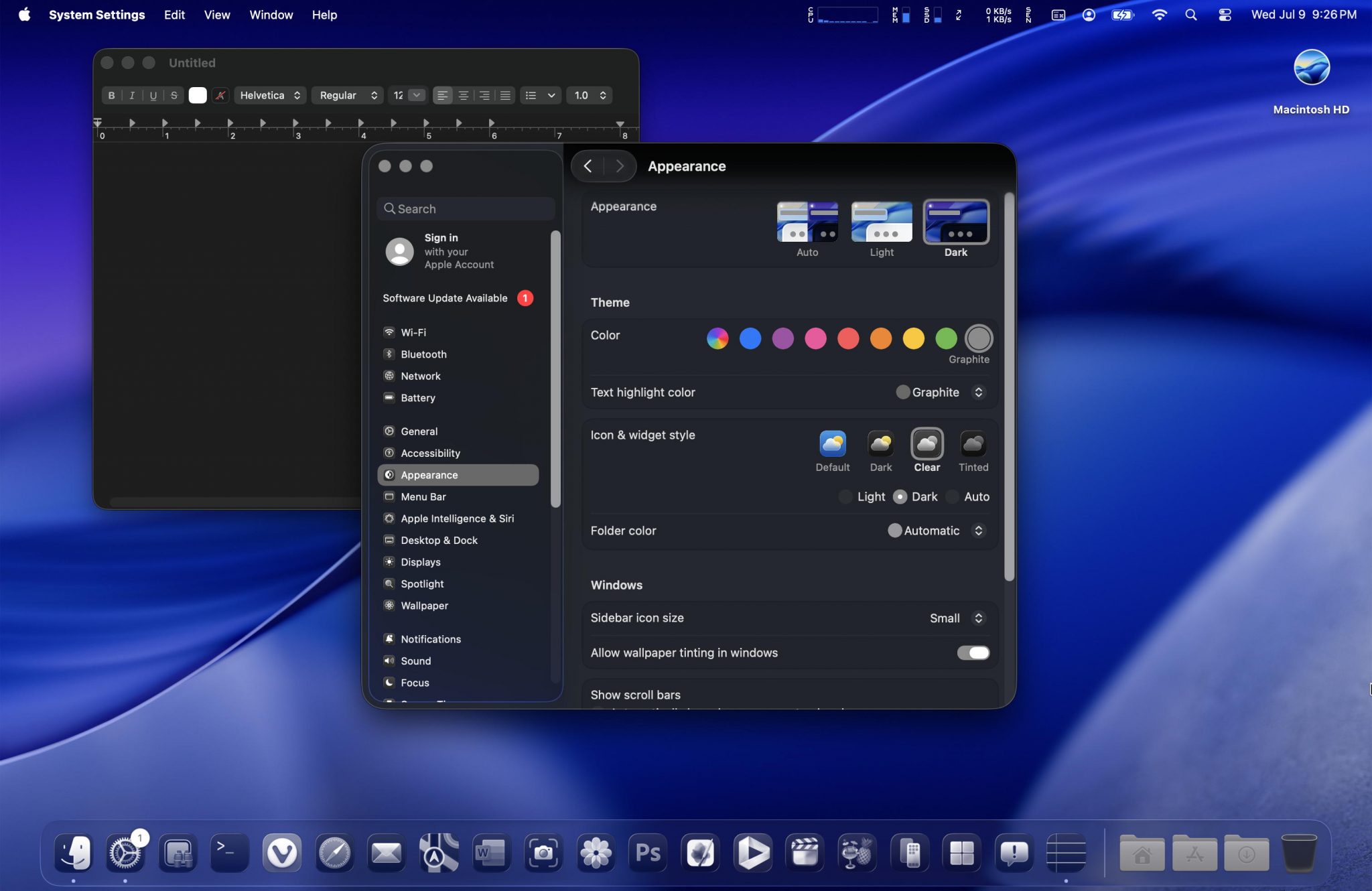
Dark appearance with the clear icon (I don’t think any of these icon/widget styles affect UI distractions; I do think it removed too much color and ended up switching back to the dark icon style).
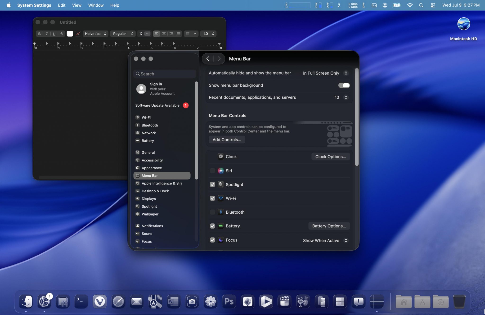
The above is with the menu bar background. It seems to come up with a diffused color that is offset from whatever the background color is (since it is acting like a glass). I personally found the color it decided on for the blue Tahoe background, a bit jarring.
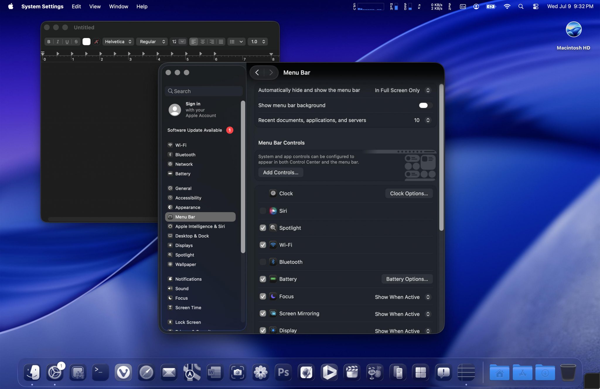
The above is with the menu bar background off, dark icon style, and changing the folders to a blue color.

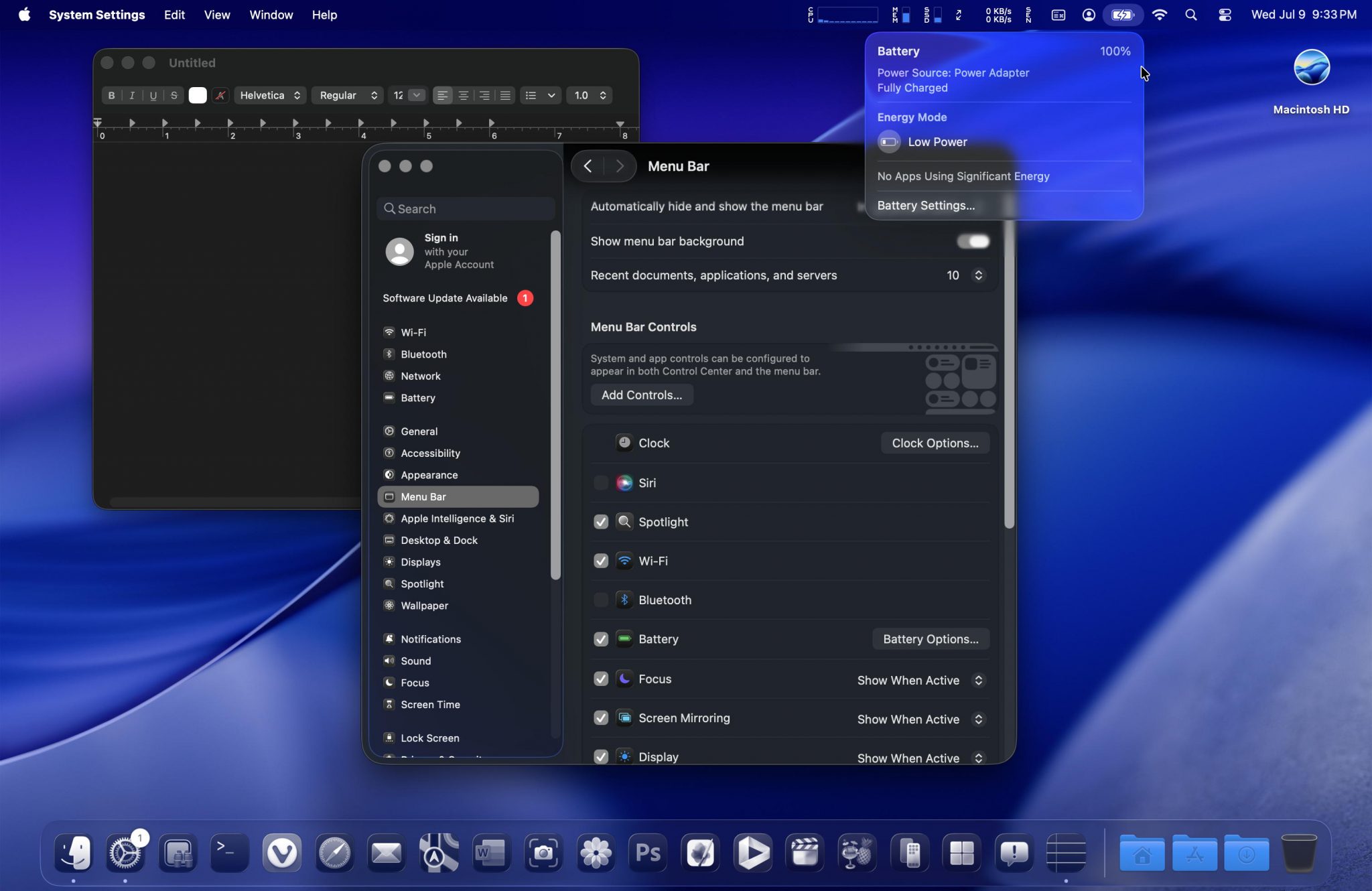
The above demonstrates the level of translucency with a pulldown menu with and without the menu bar background. A brighter wallpaper might decrease the readability of certain menu pulldown and contextual menus.
The above is with transparency reduced (this might help with lighter wallpapers; I didn’t try).
The above is with increased contrast. I found these combination of settings to be something that I could use (with one change; going back to the dark icons for some added color).
Unlike Yosemite (where I completely skipped it, El Capitan, and Sierra), I don’t have as much of an issue with the UI settings for this last screenshot. Looking back, it also reveals that since 2005 with 10.4 (Tiger), I’ve only upgraded versions when 4 years has passed between them (completely unintentional): 2009 with 10.6 (Snow Leopard), 2013 with 10.9 (Mavericks), 2017 with 10.13 (High Sierra), 2021 with 12 (Monterey), and 2025 with Tahoe. Tahoe will also be the official last version for my 2019 Mac Pro (not a big deal to me given my slow to upgrade history).
As for compatibility, the only software that wasn’t working was Little Snitch (it clearly noted it was incompatible with this version). Everything else that was installed seemed to work fine. This is really the first beta in several years now that I didn’t quickly roll back from. I guess this is what happens when you aren’t expecting a lot, and they end up exceeding your personal expectations by even a little.